Platinum Pro – Mountain Guiding
In an over-saturated market it’s important to have a look which stands out on the mountain and when it comes to the ski instruction & guiding industry it’s easy to get lost in a sea of red jackets.
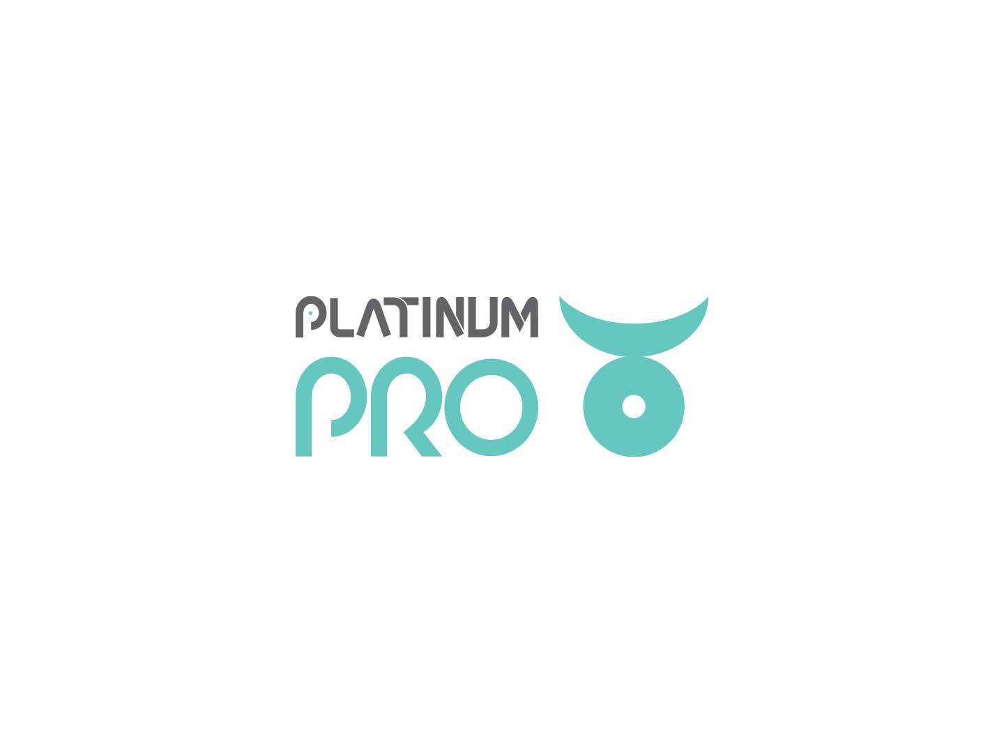
Platinum Pro attempts to appeal to the Luxe market with a slick colour scheme of teal on slate. The logo itself, composed of bespoke logo-type alongside the stylized alchemical symbol for Platinum, offers bold, easily legible viewing on the slopes as well as around town on branded vehicles.
The graphic succeeds as not only a literal representation of the Platinum Element but resembles a champions medallion – especially with its secondary placement on the chest of Instructor Ski Jackets.
Lower Back placement of the logo on ski jackets allows the wearer to use a Backcountry Safety Backpack without obscuring branding.
Final applications included website, uniforms, name badges, business cards, and van vinyls.
ClientSkiJapan Travel (employer)Year2016Linkhttp://www.PlatinumPro.com
