Shinka Apartments
A modern development in Niseko.
Shinka meaning “evolve” in Japanese, the name was chosen to reflect the ever changing nature of Niseko – a region whose booming property market is only rivaled in Japan by central city locations such as found in Tokyo.
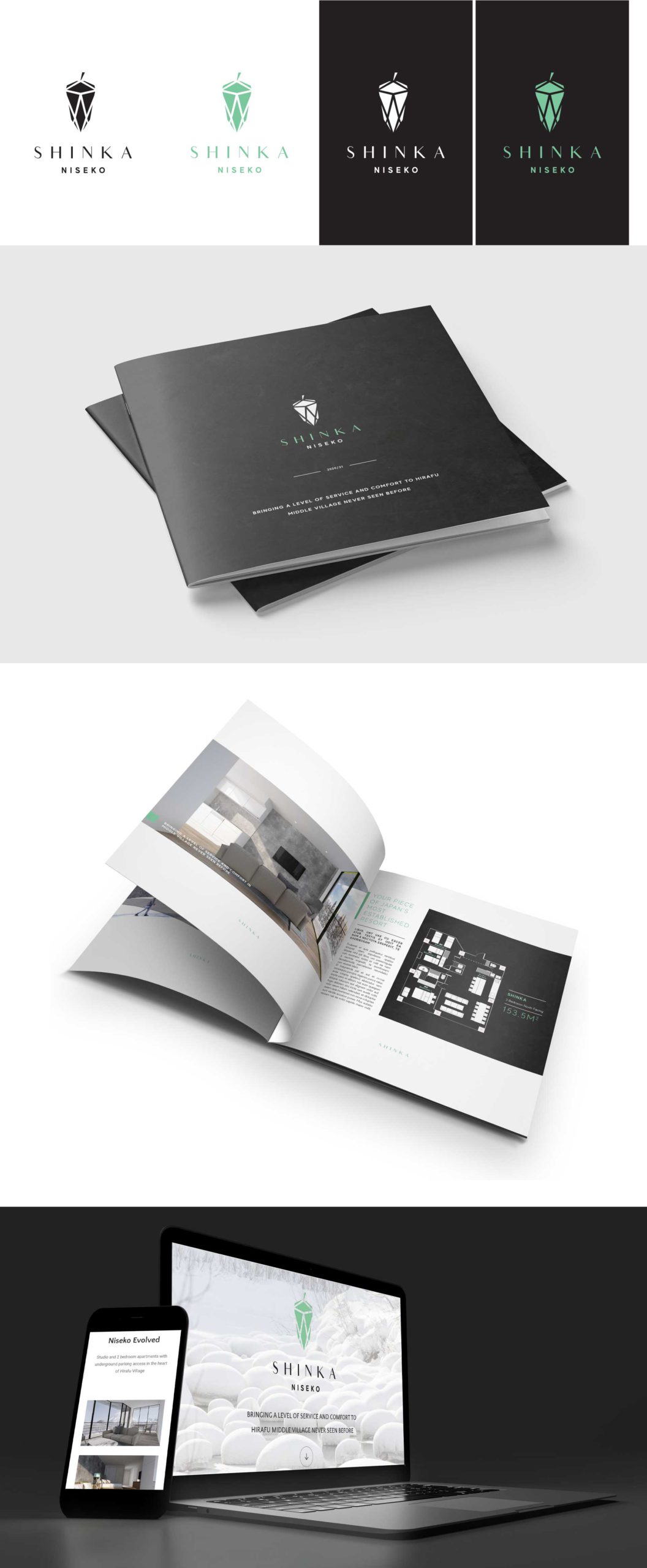
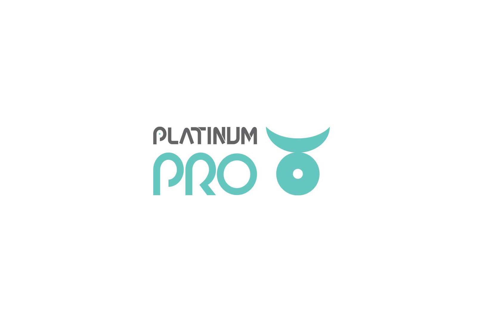
To reflect this idea a Chrysalys was chosen as the graphic element. This invokes thoughts of nature and the cycle of positive change. Complimented with a mint colour palette, and crisp, modern typface, this logo intends to instil a sense of elegance in the viewer while respecting the natural environment of the Niseko region.
Intended applications include business cards, website, social media, vehicle decals.
ClientSkiJapan Travel (employer)Year2019Linkhttp://www.ShinkaNiseko.com
Share
